Introduction
Images account for more than 70% of the page-weight of any website. When it comes to optimizing a website for pagespeed, Defer offscreen images is one of the most common recommendations.
If you’re a Developer, SEO then you might be familiar with pagespeed insights.
If you’re new to this Topic, Pagespeed Insights is a tool developed by Google to analyze a webpage performance based on various factors.
Okay, so what is Viewport?
The viewport is simply what a user is seeing without scrolling a page. You can simply relate it with the visible screen of any device.

Defer offscreen images, What does it mean ?
Defer offscreen images simply means to load images on a page only when they enter the viewport ( Screen ). This improves page speed and user experience.
How to Check if Lazyloading is Working Correctly?
After trying lots of methods and watching a lot of videos, most users get confused on how to verify that lazyloading is working on the website or not.
Well, You can check it in the browser itself in the dev tools section as mentioned below-
Open the webpage you want to check to lazyload. Right-click anywhere and click inspect to open dev tools.
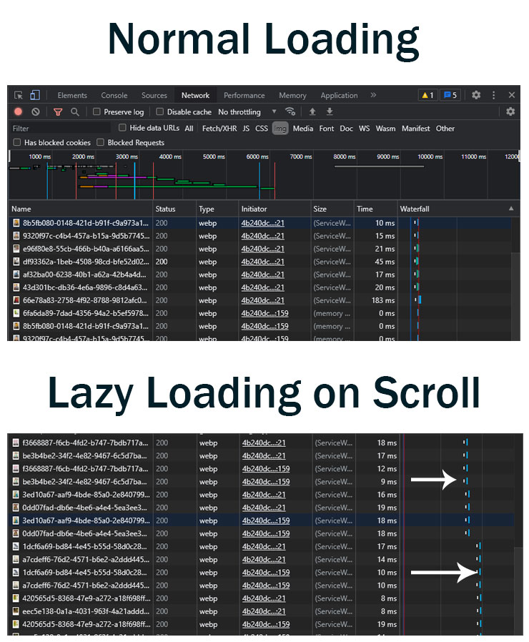
Now, Go to the Network tab & click on img tab there to see images only.
Refresh the Page & you will see all the images loaded on the page.
If images are loaded on scrolling on page, lazy-loading is working fine. And if all images are loaded initially, lazy-loading is not implemented correctly
Understanding the problem while loading images
To fix this issue we need to understand how a page is loaded. A typical webpage loads the DOM, Scripts, Styles, Content, and Images in the order they are written in code. But images are responsible for most of the page weight. So, instead of loading all the images at once, why don’t we load images only when they enter the visible area (viewport).
How to fix it?
Native Lazy Loading Attributes – We can use the loading=”lazy” attribute in img tags to load images on scroll.
Otherwise, We are going to use a lazy sizes library for this purpose.
#1 WordPress Website
WordPress automatically adds the native lazyloading attribute to all <img tags present in the content & excerpt added using the post editor.
Lazysizes plugin for wordpress
All you need to do is to install the plugin called lazysizes and activate it.
#2 HTML Website
Step 1: Include the lazysizes library
<script src=”https://cdnjs.cloudflare.com/ajax/libs/lazysizes/4.1.5/lazysizes.min.js” ></script>
Add it in the <head> of your HTML
Step 2 : Replace src in the <img> tag with data-src and add class=”lazyload” .
Change <img src=”flower.jpg”> to <img data-src=”flower.jpg” class=”lazyload”>
Live Demo
That’s all you can check results in Chrome Dev Tools that images are now loading on scroll
Conclusion
Images account for more than 60% of entire page weight. Normally, all the images in a page load with the rest resources. Images that are not in the viewport are called offscreen images. To improve Pagespeed we should images only when they enter the viewport. We can load images only when the user scrolls and images enter the viewport, using the lazysizes library.
Did we missed Anything ?
Let us know in the comment section if there is something that is missing.
Reference Links
https://iamsteve.me/blog/entry/nice-and-easy-lazy-loading-with-lazysizes-js
https://web.dev/fast/use-lazysizes-to-lazyload-images
https://www.isitwp.com/change-image-src-to-data-src-for-lazy-load-using-image_send_to_editor-filter/

